CSS3 Filters – How to apply CSS3 image effects
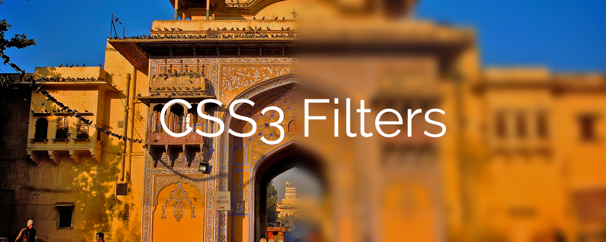
CSS3 Image Effects
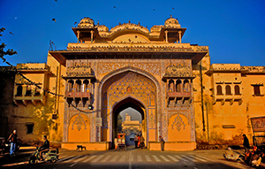
CSS3 filters can be used in many useful ways. One of the benefits you can utilize is to apply image effects using CSS3. CSS3 image effects can be applied in standard HTML tags with some new attributes added in CSS3. In this quick tutorial, we will go over a few tricks to implement the effects like image blur, brightness, contrasts and a few more options. We will use a stock photo which I have added below as an original view. Later in this tutorial, we will use the same image to apply the CSS3 filters and effects on it.
Where to start?
Using just CSS, various effects can be applied on images and other HTML tags. One thing to note here is that this feature is not fully mature for all the browsers. So Besides Chrome and Safari, other browsers may not provide the required results. Hopefully all will work in the near future.
The CSS3 property we will be using to control these effects is filters. Refer to the code snippet below.
|
1 |
filter: filter(value); |
We will also add the browser prefixes for now, ie; -webkit-
|
1 2 3 4 |
-webkit-filter: filter(value); -o-filter: filter(value); -moz-filter: filter(value); -ms-filter: filter(value); |
How to apply CSS3 filters
We have a limited choice of filters as of now. So individual or multiple can be applied together. We will see both ways.
Apply multiple filters
|
1 |
filter: blur(3px) brightness(0.9); |
How to set image brightness using CSS3 filters
Brightness in CSS3 filters are measured from zero to one. 1 stands for original brightness of the image and zero stands for the full dark (black) image. As you increase the number from 1 onwards, the brightness will increase and may become full white at a stage.
Here is the code snippet for applying brightness on image using CSS3 image filters.
|
1 2 3 4 5 6 |
filter: brightness(0.2); // Browser -webkit-filter: brightness(0.2); -o-filter: brightness(0.2); -moz-filter: brightness(0.2); -ms-filter: brightness(0.2); |
How to blur image with CSS3 filters
You can also set up blur based on browser specific by supplying the value in pixels. Here is the code snippet sample.
|
1 2 3 4 5 6 |
filter: blur(5px); // Browser -webkit-filter: blur(5px); -o-filter: blur(5px); -moz-filter: blur(5px); -ms-filter: blur(5px); |
How to set image saturation using CSS3 filters
We will use saturate() property in order to apply the image saturation. It is measured in percentage value.
Here is the code snippet for applying saturation on image using CSS3 filters.
|
1 2 3 4 5 6 |
filter: saturate(70%); // Browser -webkit-filter: saturate(70%); -o-filter: saturate(70%); -moz-filter: saturate(70%); -ms-filter: saturate(70%); |
How to set image contrast using CSS3 filters
Contrast property is measured through percentage. 0% creates a dark (black) image whereas 100% is the original image contrast. Anything beyond 100% value will increase the image contrast. Refer to the sample image below.
Here is the code snippet for image contrast using CSS3 filters
|
1 2 3 4 5 6 |
filter: contrast(200%); // Browser -webkit-filter: contrast(200%); -moz-filter: contrast(200%); -ms-filter: contrast(200%); -0-filter: contrast(200%); |
Hue rotate image using CSS3 filters
Another interesting feature we can utilize is Hue on the image. Hue is editable by rotating it in degrees. It is nice and easy to set up. Refer to the sample image below.
Here is the code snippet for Hue rotation.
|
1 2 3 4 5 6 |
filter: hue-rotate(40deg); // Browser -webkit-filter: hue-rotate(40deg); -o-filter: hue-rotate(40deg); -moz-filter: hue-rotate(40deg); -ms-filter: hue-rotate(40deg); |
Apply grayscale CSS3 image effect
Grayscale property is also measured by percentage value. It ranges between 0% to 100%.
Easy to do, here is the code snippet for applying grayscale on the image using CSS3 filters.
|
1 2 3 4 5 6 |
filter: grayscale(100%); // Browser -webkit-filter: grayscale(100%); -moz-filter: grayscale(100%); -ms-filter: grayscale(100%); -o-filter: grayscale(100%); |
Invert image using CSS3 filters
This property is also measured by percentage. You can try different values to suit your needs.
Here is code snippet for invert image effect using CSS3 filters
|
1 2 3 4 5 6 |
filter: invert(75%); // Browser -webkit-filter: invert(75%); -moz-filter: invert(75%); -ms-filter: invert(75%); -o-filter: invert(75%); |
I hope the above quick tutorial will be useful for your website project or assignment. If you have any comments or queries, please feel free to comment below.
BlueHost | HostGator | Media Temple